Unprocessed image
SPP image
Sigma SD9 raw file examination
The Sigma SD9 camera is unusual in that it uses an image sensor developed by Foveon, instead of the traditional Bayer array. this document assumes you are familliar with the differences between these sensors. If not, there are details on the Foveon website.
I find the Foveon sensor to be interesting technology, but it has not been without its own problems. It is commonly understood that these sensors rely on the depth at which different fequencies of light are absorbed to perform colour separation. However, light does not fall neatly into bins marked red, green and blue, and we would expect some level of "contamination" of unwanted frequencies in each sample. It is apparent that the SD9 raw conversion software must perform some level of colour correction to derive RGB values from the sampled data, but the extent to which these files must be processed is unclear.
The SD9 outputs a proprietary raw format called "X3F". The camera is supplied with a piece of software called "Sigma Photo Pro" which converts these into something viewable. It has traditionally not been possible to examine these images as unprocessed sensor data, as the X3F file is more than a simple dump of the sensor values.
Fortunately, help is at hand in the shape of Dave Coffin, which has reverse engineered several camera raw formats and produced a camera raw convertor called dcraw. Dcraw does its own processing of raw images to produce viewable files, using algorithms which are not necessarilly the same as the camera manufacturers' software. However, since dcraw is open-source, we are able to produce a modified version which will just extract the raw image data and write it to a 16 bit Photoshop file, without performing any processing on it.
I produced a modified version of dcraw for Mac OS X, initially by simply removing two function calls from the C source, namely "foveon_interpolate()" and "foveon_coeff()". When used to produce a Photoshop file, this modified dcraw simply decodes the SD9 output and dumps it as-is. This allows us to see the files with no image processing applied.
Having produced my modified convertor, all I needed was images. Not ownding an SD9, I had to put out a request on DPreview.com for raw files. Three people from the SD9 discussion forum, "Obscura", Kendall Helmstetter Gelner and "Alatar" came forward with sample images, and I am eternally grateful to these people for helping me to indulge my curiousity.
(Note, I shall shortly be providing source code for my modified dcraw, as well as binaries for OS X and Windows. Watch this space).
So what do they look like?
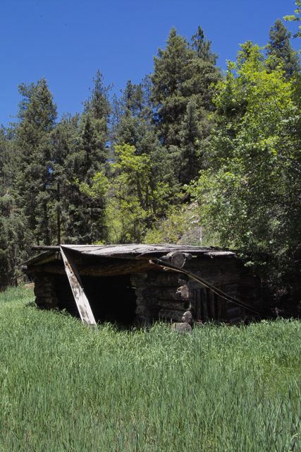
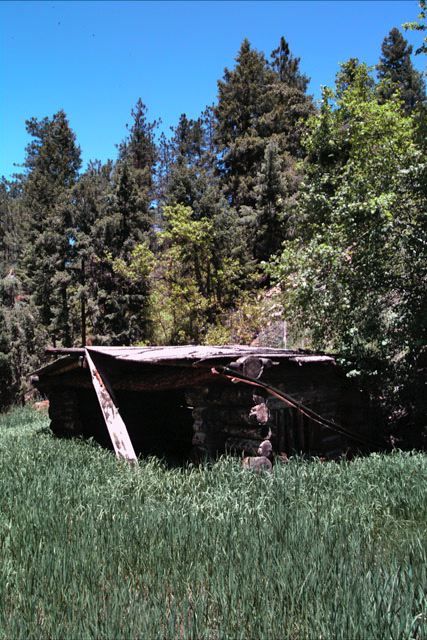
The short answer is, dark! The images are linear and the SD9 doesn't produce full 16 bit raw values, so the image needs to be "stretched" using the levels editor, and then "gamma corrected" using the curves editor before it can be viewable at all. After doing that, we are left with an image which starts to look usable as a photograph. The left image below was loaded into Photoshop CS, set to the Adobe RGB colourspace, then put through a Photoshop action I created called, "From Linear". This applies levels correction by setting the upper input value to 23, and then creates a new point in the curves editor, with input value, 64, output value, 128. I have downsized the image for web use, and converted it to sRGB, but it is otherwise untouched. The right image is the default output from SPP. This image was kindly provided by Alatar.
|
|
|
This image contains a good number of saturated colours, and gives us a good idea of how the SD9 sensor actually reacts to different colours. Initial impressions are that the colours are pretty muted - there doesn't seem to be clean separation between the different colours. In particular, the sensor seems to be much more sensitive to red than to green or blue. Reds, oranges and purples come through fairly strongly, but greens and blues are very dark.
The reds themselves seem to be tending to a kind of deeply unsaturated yellow, which suggests that the "red" channel is also responding very strongly to green, and somewhat to blue. The greens are probablyh the most unsaturated of the lot, which suggests that the "green" channel is responding to red and blue almost as much as it is responding to green. The "blue" channel appears to be responding primarilly to blue, with some green and a little red in there as well, but the response in the blue channel is not very strong. This may be related to this image being shot indoors, but if the blue channel generally requires boosting, this could explain the sky-noise that some people claim that SD9 images can br prone to.
Before attempting some sort of colour processing ourselves, it's probably worth having a look at some "real world" images. The image above was deliberately chosen as a kinbd of "torture test". Real world images tend not to have such a wide-spread of saturated colours, so we might expect that the results might not be quite so striking. The following images were all kindly provided by Kendall Helmstetter Gelner. As before, the SPP version is on the right, the unprocessed version on the left.
|

|
|

|
The image in the centre is the SPP image. The image on the left is the unprocessed image. The one on the right is the unprocessed image with unsharp mask applied in Photoshopat 300%, radius 0.8 pixels, threshold 0. SPP on its default settings sharpens its output, so the unsharp-masked version is provided here for comparison.
Although the sky is significantly less saturated in the non-SPP images, the difference is noise is quite dramatic. It appears that the noise in this image is not inherent in the sensor, but is introduced during the colour-correction of the image. I have also noticed, when working on other images, that the banding artifacts which can occur in colours as the approach blow-out in SD9 images appears also to be an artifact of raw conversion, and not present in the original image.
So what can we do about colour?
Clearly, bypassing SPP and using raw files directly has potential for certain types of processing, particularly if we want to produce black and white output. It may seem strange to use the Foveon sensor for black and white work, but if we think about it, it's actually quite a good idea. When I shoot black and white film, I quite often use a coloured filter over the lens, and if I were to produce B&W output from the red channel on my EOS 10D, I would be wasting most of the sensor because I would be cutting off up to 75% of the sensors from contribution to the output, depending on the colour of filter used. Since the SD9 does not have this limitation, bypassing SPP and getting a lower-noise image without the colour artifacts that can be present in SPP processed images has its attractions.
However, what if we want to try and colour-correct these images? I have, mostly through trial and error, produced a set of Photoshop actions which use mainly the curves editor, the channel mixer and the hue/saturation tool to attempt to match the colours of the SPP produced images. This is how these actions affect the colour-test image provided by Alatar:
| Initially, load the raw image from the modified dcraw and use the "From Linear" action to make it viewable. |

|
|
This is the result of the "Mix channels" action. All this does is use the channel editor to "remix" the red, green and blue channels. The values were arrived at through trial and error: Red red +200% green -140% blue +40% Green red -50% green +200% blue -50% Blue red 0% green -100% blue +200% |
|
| This image has been white-balanced. This is done manually by selecting a number of points on the grey-chart in the curves editor, with Apple-shift held down, so that it gives seperate points on each of the red, green and blue curves. Since each one of these points is supposed to represent grey, we set all 3 values to be the same as the one in the middle, and a custom white-balance curve is created. It is important that the image is correctly white-balanced for the next step. |
|
| This is the result of the "fix hues" action, which uses the hue/saturation editor to selectively adjust the hue and saturation of the different colours in the image. The image is now looking something like the original, although it's not a perfect match (in particular, it is quite dark compared to the SPP version, although this is trivial to fix in Photoshop). |
|
|
|
|
|